Overthinking a Lab Logo
In setting up the textiles lab at Carnegie Mellon, I found myself wanting some sort of logo to represent the lab, e.g., for the organization's github icon. So I set out to design something that satisfied three properties:
- The logo should represent or reference the textile manufacturing practices we use in the lab.
- The logo should be simple and abstract.
- The logo should be re-creatable from memory in most drawing software.
Of these properties, the first probably requires no justification and the second is a stylistic choice, but the third may be somewhat less obvious. However, it is a constraint that holds of (e.g.) the tchow logo, and one that has come in very handy in the past. It means that instead of scrambling for an internet connection and attempting to download a file in a format compatible with whatever manufacturing equipment or display one is using, one can instead recreate the logo on the spot in not so much time.
The Shape
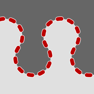
In the lab, we work with knitting, weaving, and embroidery. I settled on a shape (a wavy line) that can reflect all three of these processes:
-
The logo could be the basic shape of one course of a knit fabric, as viewed from above.
-
The logo could be the over/under motion of a weft yarn in a basic weave (as viewed from the side).
-
The logo could be a smooth sewing path in an embroidered object.
The Construction Process
In order to satisfy property (3) -- ease of construction from memory -- I needed to design a straightforward construction process.
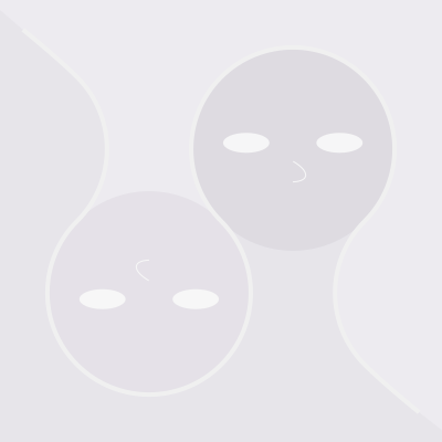
The logo is built on two rows of tangent circles.
There are many ways to set up two rows of circles to be tangent.
Indeed, there are an infinite number of variations -- any horizontal spacing h, vertical spacing v, and circle diameter d < h satisfying h*h + v*v == d*d produce such a family of circles.
To keep the logo easy to construct by hand, I decided that the spacing and radius should be small, rational numbers (i.e. that h,v,d should be a Pythagorean triple). Conveniently, building the logo based on a 3,4,5 triple produces a good result:
(Though you should feel free to play with the above widget to try out some other shapes. I also like the look of the 1:1 logo and it's not hard to construct in a drawing program by building on a diagonal and then rotating.)
Conveniently, the 3,4,5 triple results in a logo that is wider than it is tall, which makes bounding box selection quite easy: just center the logo, and make the box wide enough to touch the leftmost and rightmost points in the logo. For alternate versions of the logo that are taller than they are wide, bounding box selection requires some notion of how much padding should be kept between the top and bottom of the logo and the boundary, unfortunately adding another degree of freedom to the design process.
The Final Products


I've now created quite a few instances of the logo, which you will probably encounter sprinkled throughout the page. Despite all the care taken in the previous section, I haven't followed my own advice -- I've mixed 1:1 and 4:3 versions, and cropped things differently for different purposes -- but the design seems to be graphically powerful enough to remain recognizable despite these liberties.